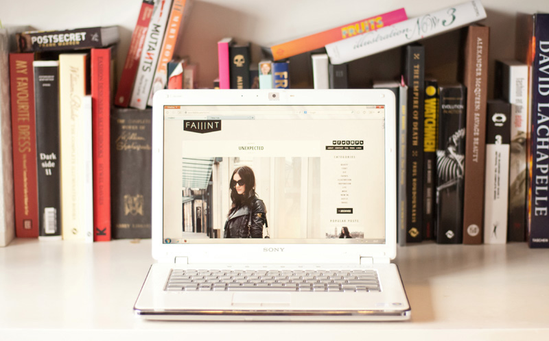
You might have noticed things are looking a little different around here & this new layout has been so long overdue. I never expected blogging to be something I’d actually keep up for this long, so the first layout was pretty rushed & it was mostly a case of it’ll do for now. I promised myself I’d redo the layout for the blogs 1st birthday, but that came & went and I never found the time to do it. So, with nothing more exciting planned this weekend I decided to finally get to work on something a little more fitting.
It’s not drastically different, I just wanted something a little cleaner, more graphic & something that better fitted with the aesthetics of the blog. I seriously contemplated going for a black background (à la Le 21ème – swoon), but decided lighter was more user friendly when there’s text to be read. The most noticeable change however, other than a generally cleaner look, is obviously the huge images. Ollie’s photography is such a massive part of this blog and I felt like it wasn’t being shown off to it’s full potential in that tiny column before, so here they take center stage.
I hope you guys like it as much as I do. If you have any comments or suggestions (good or bad!) on how it all looks, I would love to hear your opinions. But especially if somethings not working right, or looks squiffy on your end, then please do let me know so I can get it fixed! I’m sure there’s a few little things I’ve missed, but hopefully everything else is in good working order!
PS: That photo up there was taken by me, not Ollie, I think he better watch out – I’m learning! Hah!


Kylie says
It looks fantastic steph! and not too far off the old design, so won’t confuse people. Yes indeed your images are a massive part of the blog and they need to be shown off to their full potential xx
FAIIINT says
Thanks Kylie! :) Yeah, I tried not to make it too different so it wasn’t too weird for people!
TheBantuGirl says
I love the new look!!! I’ve been working to improve my camera skills – it is as though I am learning Greek or Sanskrit! ooooiii…
FAIIINT says
Haha! Oh, I’m exactly the same! I’m super creative & I love technology & gadgets, yet I am terrible with a camera! It’ll be a long learning process I think! ;)
Hannah says
I love it Steph, I love the way the new images have no border and they fill this column too – very neat! I used to have the tiniest images for my blog, when I go back through old posts I can’t believe how different it looks just because of the small pictures! xx
FAIIINT says
Yeah, I think it makes a massive difference! I’m surprised by just how much brighter & more spacious it all looks, and I think that’s mostly due to the huge images.
Hannah says
It does look a lot brighter :) it’s fab! I just realised I forgot to reply to your question about the All Saints outlet at Cheshire Oaks – I think it’s definitely worth checking out. The prices aren’t quite as cheap as those of the tops I bought, but it’s still a great discount normally. If it’s somewhere that you like to shop, you can get some gems :) I’m forever keeping my eyes peeled for scarves to end up there, I’ve not seen any yet but I’m not giving up haha they seem to have everything but! There are some other great shops on the Cheshire Oaks outlet so it’s worth a day trip if there are a few places that take your fancy xx
FAIIINT says
Ohh, I will definitely have to take a trip up there then! I was looking at their website the other day & they have lots of stores I love. Will have to wait till I actually have some spare cash though, nothing worse than going somewhere like that with no money to spend! Hah!
J. says
Love the new layout and of course love the big photos! Looks great!
heather says
I love the layout! I seriously need to re-do mine! It’s just finding the time to do it. herm…lol
<3
heather
fashionistanygirl.com
Arusi says
I’m a fan. Is your blog WordPress hosted? It’s so clean. Following you on Instagram as well now – I feel a kinship due to our shared penchant for all black everything, seasons be damned. Followed you on Bloglovin so now I can keep in touch.
x Arushi
http://www.bohemianlikeyou.net
+ http://www.arushikhosla.tumblr.com
FAIIINT says
Thankyou Arusi! Yeah it’s self hosted WordPress. Glad to see another all-black lover stopping by, I’ll check your blog out later today :)
Aisling says
Love it Steph! Not too far from the old but a nice little freshen up. Best to make the best of the gorgeous images after all!
Tara says
It’s so sleek and professional! I love it. :)
Steph says
Love the new look steph! It still feels very familiar but I love the little detail updates and definitely agree on the bigger images and ollie’s photographs (and yours!) definitely deserves to be showcased better :) that was what i was thinking when i did my blog earlier this year too. style blogging is so visual isn’t it! i love Le 21ème too and i think you could definitely make black work if you wanted but the light colours make your black outfits stand out more. and i used to be totally intimidated by a DSLR but i went for a 6-week intro course here at the australian centre of photography and it has been really good – but i’m sure ollie will gladly teach you! :-)
FAIIINT says
That’s exactly the word I was looking for ‘familiar’! I get all weirded out when blogs are redone & look nothing like the old version, it’s like ‘I’m sure I clicked this blog, where am I?!’ Haha! So yeah, I thought it was important for it to still look quite familiar. That’s a good point about the white background / dark outfits, I think the black on Le 21eme really makes the photos pop, but contrast is important too when you wear mostly dark colours.
Ollie tried to teach me but gave up in frustration! Hah! He’s now lent me his old, old DSLR & just said ‘here have a play with it & figure it out!’ – I always learn best by just doing & figuring it out myself.
Rebecca says
You new layout looks just fantastic! It is nice to have a fresh new look!
Rebecca
http://www.winnipegstyle.ca
Gabrielle says
LOVE the redesign. And you’ve totally inspired me to do one of my own.
You’re right, the black background is definitely cool, but more appropriate for a solely photographic blog.
I am SUPER envious of the giant photos. I think taht makes for such a fantastic upgrade, and really shows off the quality of your images. It must have taken quite some time, but congrats on the awesome new look.
-Gabrielle
FAIIINT says
Thanks Gabrielle! Glad to hear it’s inspired you too, that’s a great compliment! :)
The larger photos are definitely my favourite part too, it makes such a difference.
NotJustAPrettyDress says
Steph, I love the new layout! The blog is still very much ‘Faiiint’, but the look is cleaner and even more professional (if possible!). I’m glad you kept this lighter background colour because it has a very nice effects with the black boxes. Congratulations to you and Ollie for the beautiful pictures! Take care! Caterina
Sonia says
I’m swooning over this my dear! Sorry I didn’t leave a comment last night, I was logging off until I saw your FB post and had to click! I like that it still has the same esthetic; your blog layout was and still is incredibly unique and as it was it would have been a shame to loose it in the internet world. I really love the bottom bar with the black ‘peak’ I’m into triangular things of late so that totes won me over! In terms of any negative maybe a little more space between the post and side bar? Then again I work on a 15″ MacBook so my screen always has that little more space to fit in without those nasty side bar drag thingys (you know what I mean LOL) so if it fits fine on a 13″ (I presume that’s the smallest right?) then disregard previous note!
SDMxx
http://www.daringcoco.com
FAIIINT says
No problem! Thanks for your FB comment, it put my mind at ease about the Safari issue I was having :)
Will definitely keep in mind about the screen sizes & the spacing, mines a 14″ Windows laptop, so I guess that’s been a big factor in the widths/spacing when I was designing it. I also made it so that it fitted perfectly on an iPhone or iPad, so I’m not sure I can fit any more spacing without making the photos or sidebar smaller, I do really need to check it out on a 13″ to be sure (may have to go to the Apple store & check on their laptops LOL!)
jamie-lee says
You did a great job – it’s not a huge change so not a lot of adjusting needed but overall I love the feel of the new look. Great job love!
Laura says
I really like it, more neat and tidy, especially like the column on the right hand side.
Well done you!
xXx
Blog: http://unspeakablethoughtsunspoken.blogspot.com
Shop: http://unspeakablethoughtsunspoken.tictail.com
Maria says
I LOVE the new look, very sleek!
Maria xxx
lauren says
looks great, glad you stayed with the colour you’ve got rather than black, black can be a bit harsh.
Lauren
Jessie says
love the new layout. very clean and tidy. i just bought my template from an etsy store, since i know absolutely nothing about html. you are awesome! =)
rakhshanda says
Love this layout Steph!!! <3
Latest look:
http://rakhshanda-chamberofbeauty.blogspot.in/2013/07/you-dont-need-to-occasion-to-wear.html
FASHION TALES says
I love the sleek new blog look. I’ve been wanting to change my layout for some time, I am too busy, but will need to get that sorted soon. Great image! /xx Madison
Pixelhazard says
Great shot and there’s really nothing like a little layout tidy up is there? My layout is pretty tidy but I’m still itching to do something different after 6months of the same thing. I’m so fickle
x. PixelHazard | Bright Green Laces |
Mika says
I like the cleaner look! Personally I’m not a fan of dark backgrounds for websites—it makes text harder to read and makes my eyes tire faster.
ODYSSEY says
I like it very much. Looks really good!
findmeamuse says
I love the new layout. Very sleek and professional. It’s a great way to feel refreshed about blogging too. Have a great weekend.
– Mandi
http://www.findmeamuse.com
Cattail Down says
I like the layout of the blog and the way its simple/lightness contrasts the darkness in a lot of the outfits you’ve showcased lately. It gives it a really cool atmosphere. NIce job.
S&R
New Post!
http://www.cattaildown.com/my-blog/2013/07/cosmetic-pouch-essentials.html
Melissa Araujo says
Stephanie I really like the new fresher look. It is subtle but we can see the difference, sleeker and cooler. Good job!
M